Loading...
Loading...
A comprehensive guide to Zelfium's visual identity, design principles, and brand voice to ensure consistency across all touchpoints.
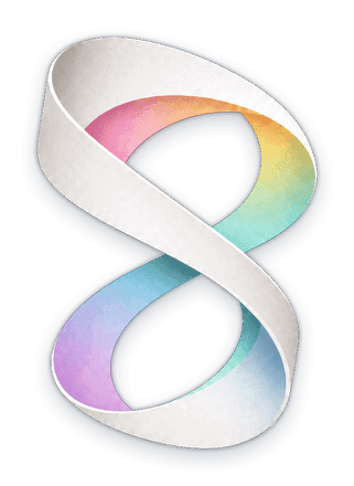
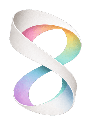
このロゴは、Zelfiumが目指す「人格の構造を美しく可視化する」という思想を、白い和紙のリボンと淡いグラデーションによって表現しています。
白い和紙の面は、静かで余白のある自己を象徴しています。 その内側に差し込むパステルグラデーションは、人の内面に存在する多様な精神的因子、感情、思考の揺らぎを表しています。
形状は、DNAの螺旋構造から着想を得ています。 ただし、生物学的な遺伝子そのものではなく、Zelfiumにおける「精神の因子」や「人格を形づくる見えない構造」を象徴しています。
また、この形は見る角度によって、Zelfiumの頭文字である Z、和のしなやかさを感じさせる 乙、そして無限の成長や可能性を示す ∞ のようにも見えます。 ひとつの意味に固定されない多義性によって、人格が単純なタイプ分類ではなく、重なり合うスペクトラムであることを表現しています。
白と色、余白と構造、静けさと動き。 このロゴは、Zelfiumが提供する「自己理解の地図」としてのブランド体験を象徴しています。
Dynamic (Theme-Adaptive)
Light Mode
440 · 512 · 1024 · 2048px
Dark Mode
440 · 512 · 1024 · 2048px
Download the Zelfium logo with text in various layouts and color schemes. All images use the Montserrat Bold typeface.
ZelfiumZelfiumZelfiumZelfiumDigital Minimum
Print Minimum
Favicon Size
Zelfium のビジュアルアイデンティティの変遷。過去のロゴは参照用に保存されています。
白い和紙のリボンと、その内側に差し込む淡いパステルグラデーション。現行の正式な Zelfium マーク。
グラデーションを添えた二層の同心「Zf」タイル。モビウスのリボンに引き継がれた、以前のマーク。

開発初期に使用された最初のロゴマーク。よりシンプルな形状の単層デザイン。
Primary (Light)
Secondary (Light)
Primary (Dark)
Secondary (Dark)
Pastel Pink
Soft Yellow
Light Green
Sky Blue
Lavender
Discovery Gradient
Sunrise Accent
Nature Accent
Twilight Accent
Blossom Accent
Regular paragraph text. Zelfium helps you discover your unique personality traits through advanced AI analysis. Our assessment system provides detailed insights into your behavioral patterns, preferences, and potential.
Medium emphasis text. Discover your true self with our scientifically validated assessment tools.
ゼルフィウムは、AIを活用した次世代のパーソナリティ評価システムです。あなたの独自の性格特性を発見するお手伝いをします。
This text scales based on screen size.
Information should be presented in a clear, straightforward manner. Avoid clutter and unnecessary complexity.
Maintain consistent design patterns, spacing, and visual language across all touchpoints to build trust and familiarity.
Design for all users, ensuring content is accessible regardless of ability or device. Follow WCAG 2.1 AA standards.
Use animation to enhance understanding and guide users, not for decoration. Animations should be subtle and meaningful.
Create flexible layouts that adapt seamlessly to different screen sizes and devices, maintaining usability across platforms.
Our brand voice reflects our mission to help people discover their unique personality traits in a supportive, insightful way. How we communicate is as important as what we communicate.
We communicate in a friendly, conversational tone that makes complex topics accessible without being condescending.
Instead of: 'The assessment utilizes advanced algorithms to analyze responses.'
Use: 'Our friendly AI helps understand what makes you unique.'
We provide meaningful observations and perspectives that help users gain deeper understanding of themselves.
Instead of: 'You scored high on openness.'
Use: 'Your curiosity and imagination drive you to explore new ideas and experiences.'
We focus on growth and potential, emphasizing how self-knowledge can lead to better decisions and relationships.
Instead of: 'Your personality type has these weaknesses.'
Use: 'Here are opportunities for growth that can enhance your natural strengths.'
We communicate honestly and transparently, avoiding hyperbole or making promises we can't fulfill.
Instead of: 'Our test will completely change your life!'
Use: 'Discover insights that can help you make more informed choices.'
Avoid: "Your results were analyzed by our system."
Prefer: "Our system analyzed your results."
Avoid: "In the event that you wish to proceed with the assessment, it is necessary to complete all questions."
Prefer: "Please answer all questions to complete the assessment."
Avoid: "He will find his results in the dashboard."
Prefer: "You'll find your results in the dashboard."